The Brief
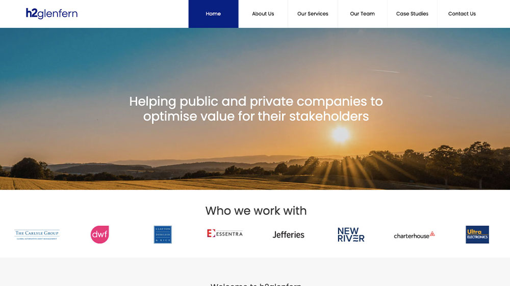
H2glenfern help public and private companies to optimise value for their stakeholders. The client approached us to redesign both the brand and website, with an aim of representing the business as a more modern and forward-thinking advisory firm.
The Solution
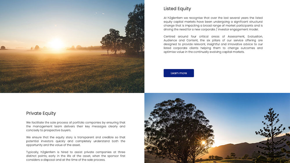
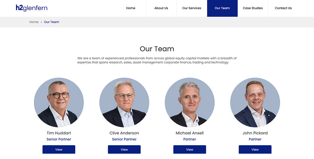
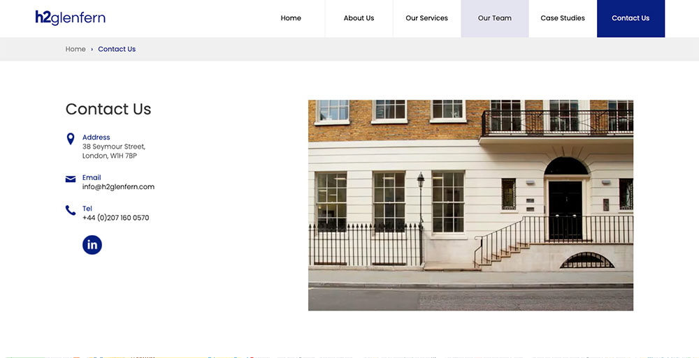
During the kick-off meeting with the client at their Mayfair office, we outlined a new visual brand direction and website sitemap. We focused on the user journey through the WordPress website, from the initial landing page, to learning more about the services, to becoming a lead.
The Result
The h2glenfern website is a clear, concise and modern looking financial advisory website. Unlike its predecessor, the new website is easy to navigate and offers a simple and straightforward navigation system, enabling the audience to quickly find the information that they are looking for.
Client Testimonial

Natalie Crisp
Office ManagerRed 13 delivered a highly professional rebrand and website for h2glenfern. Their experience in the financial services industry, and understanding of our business goals, enabled them to form an impressive strategy for the project and guide us along the journey. We are delighted with the results.


